
Monday, 6 June 2016
Monday, 25 April 2016

The bush is in a town centre where no much wildlife grows

this is showing some wildlife growing in the town next tow the bus stop

a piece of man made sign in the park full of nature.

a grid in the park which is man made

man made statue in the park
 The photos I have selected all have on thing in common. They are opposite to their surroundings.
For example this plaque and a stone monument is clearly man-made and is doesn't match it's surroundings as it is all natural.
 a bench in the park which is man made
a statue in the town centre
a view of buildings in the scotsmans flash which is very peaceful

Monday, 7 March 2016
Evaluation
Evaluation
- 3 Images sourced from the web of urban scenes for rule of thirds
- 10 photographs taken by yourself of urban scenes for rule of thirds
- 10 photographs taken by yourself to show urban juxtaposition
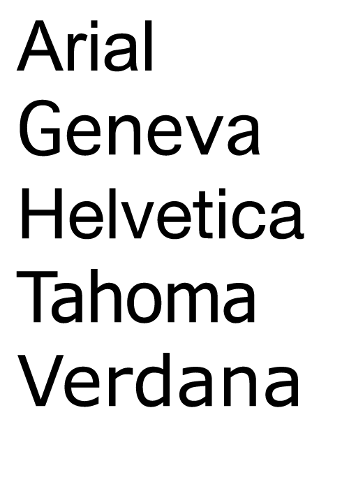
- 8 examples of typefaces in use from the internet that show serif/San serif/script
- Take a photo of each types face and annotate it
- 5 examples of photography exhibition posters
- At least two A3 sheets of thumbnails sketches for outcome for final piece
- Your final Urban Juxtaposition photography poster
We was asked asked to take 3 images from google that showed the rule of thirds.The most difficult thing I did was having to find rule of thirds in from both vertical and horizontal . I found annotating a little hard as I didn't know how to write professional. I used a camera and went out to the lake and town to take pictures for my urban juxtaposition. I had learnt how to use illustrator, fonts and colour. The work i went thought went really well would be my urban pictures from an angle I took them on. What I could do differently would be to o take more pictures and use more time through the weeks to take my time to make sure that there were more pictures and use less time looking at internet pictures. i should of gone out more and took better pictures of close ups and landscapes and spread my work out so i am not rushing days before deadline, the main thing i learnt in this project would be how to illustrate my work and put shapes into the back of writing. I think that I would of liked more time on this as i haven't done much as I would of liked.
Wednesday, 2 March 2016

Tuesday, 2 February 2016
5 examples of photography exhibition posters
 |
| This poster has the quality that many don't have when I look at poster it bright and friendly not to much in your face this is why I believe it is a great poster with all the information displayed on it. |
 |
| This is a different type of poster for it because its for a school but it shows the same amount of qualities as a normal poster as it shows bright and bold text to grab people attention as they walk by. |
 |
| This one caught my eye because of the bright colours it gives off which is a great example of a poster which grabs the attention and gives the correct information for the event. |
 |
| In this poster it shows someones image they have done which got chosen which looks incredible with the Photoshop effect on it. It also shows the time and date very clear so you know when it is . |
 |
| This poster is a good example of a poster as the shows the information about the exhibition as it gives the place where it held at. |
Monday, 11 January 2016
Typegrophy- Typefaces


These are both serif.


The two above images are script, I could easily spot this as they look like posh handwriting.


 |
| These are all sans-serif |
 |
| This is the font script, this is my favorite font and it looks like really posh handwriting. |
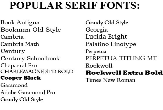  |
| This is the the font Serif and it is more of a modern but has an ta bit of script with the g's so I like it. |


Urban Juxtapostion
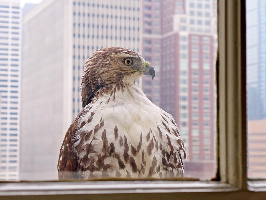 |
| This image is a rule of thirds as the bird is in the middle of the picture and is showing some juxtaposition with the buildings in the background as the birds home has been destroyed an now is around the town when it lives in forests. |
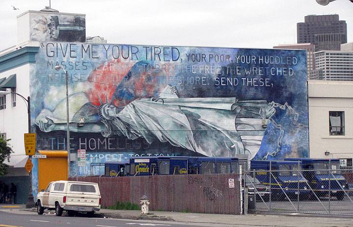 |
| This is a good example of Juxtaposition as the building is shown to have a urban vibe as the wall is covered in graffiti. Which shows how people act to the areas they live in, but it also gives a message about God. |

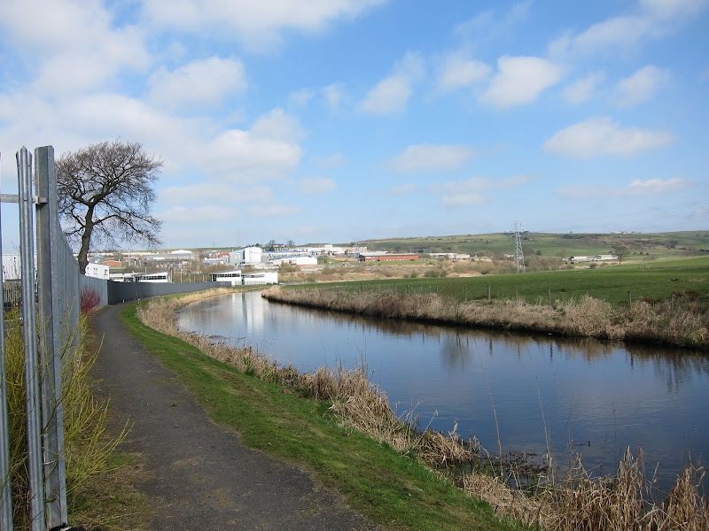
This image is urban juxtaposition because of the building being covered in grass and leaves. Which shows the nature said of the town.
This is urban juxtaposition because of the
Subscribe to:
Comments (Atom)